We contribute to customers and
society through our technology.
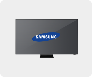
The wordmark of Samsung emphasizes flexibility and simplicity. The oval shape that represents the universe and global stage has been slightly tilted to symbolize the dynamism and innovation. The two open parts respectively on the top left corner of ‘S’ and the bottom right corner of ‘G’ symbolize flow of energy inside-out and vice versa, thereby embodying the corporate intent upon being aligned with global community and contributing to humanity. The prestigious logo design delivers the corporate commitment to customer satisfaction through technology as well as the modern image of a leading company.
The primary style of the wordmark is a combination of the oval and the company name in uppercase letters with transparent background. Therefore, background space should be properly chosen before placing the wordmark in order to maintain the integrity of the visual identifier and reinforce the strength of the corporate identity.
This version is to be used exclusively for videos and films, websites, and outdoor media, and should not appear on printed media. The oval and the company name are separated to enable a three-dimensional representation and applications on far more diverse backgrounds.
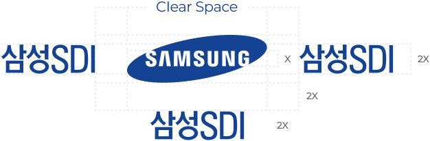
For all printed media and publications
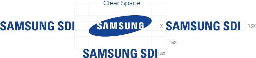
For all printed media and publications
For videos, websites, and screens


